A SEASIDE KITCHEN
Symmetrical Simplicity defines a kitchen furnished with Workstations and Stainless Steel Appliances!
Four years have passed since Peter and Sue Mulroe started the renovations to their 3-story Victorian fixer-upper in the seaside town of Ocean Grove, NJ. At the time, it was divided into five rental units, its original siding was covered with aluminum siding and the stylistic details were missing. The planning process took many twists and turns but finally, with Peter as the general contractor, the interior was stripped to the studs as renovation commenced.
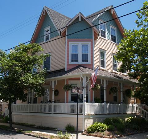
Now, the five bedroom, three bath home has three living areas, one on each floor. The owners wanted to create different but connected living areas to share with their three young-adult (but often returning) sons. The entrance level features the open-plan kitchen/dining and sitting area, two guest bedrooms and a bath. The second floor opens to a front to back living area, the master bedroom and bath. The third level features another front to back living area, two guest rooms and bath and a large outside deck, from which views of the town and ocean can be enjoyed.
The restored and newly painted exterior demonstrates why the project just received a coveted award of excellence from the Historical Society of Ocean Grove. The interior was completed with the same amount of care, but with very different results. Its carefully designed, eclectic blend of old and new design ideas creates the comfortable, easy-living environment that is consistent throughout the home.
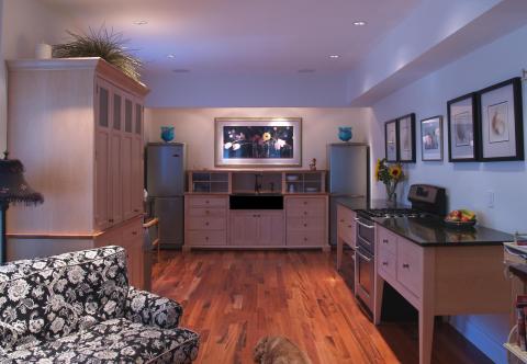
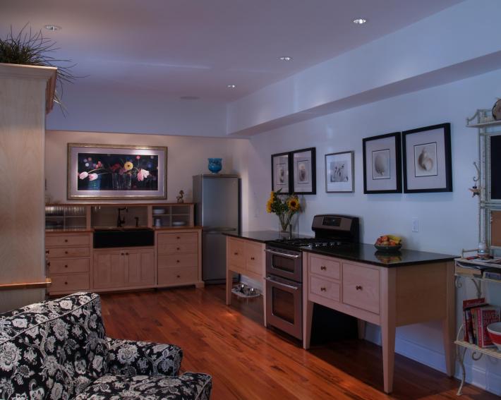
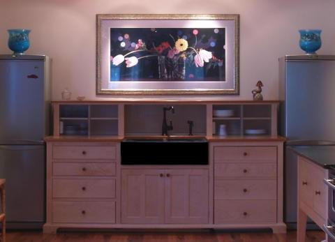
This seaside kitchen/living area sets the stylistic tone by blending one of the oldest kitchen design concepts (furniture) with the newest (stainless steel appliances). Instead of cabinets, the kitchen was furnished with four separate pieces of furniture from YesterTec’s line of Kitchen Workstation Furniture. LG freestanding stainless steel refrigerator and freezer units flank the Sink workstation, and two Worktables flank the stainless steel range. The fourth workstation stands alone as a Working Pantry containing hidden counter space and concealed storage areas.
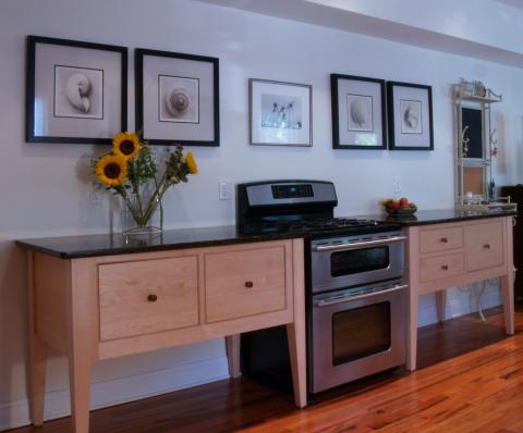
The sculptural symmetrical maple workstations blend with the hi-tech appliances to form two separate but symmetrical work areas, each focused around the sink or range. This symmetry, coupled with the lack of upper cabinets gives this kitchen its simple, comfortable feel because symmetry is so easy for the eye to understand (compared to the often chaotic assemblage of continuous cabinetry, counter tops and appliances). The continuity of seeing the tiger-wood floors and light colored walls between all the furniture pieces also allows the adjacent living and dining areas to blend flawlessly into the kitchen.

The storage capacity of the freestanding Working Pantry eliminates the need for continuous bands of upper cabinets and allows those areas above the counters to be used to display art work. There is room between the individual pieces for the dog’s water bowls and an original window that could not be blocked by standard cabinetry.
Using Worktables to flank the range instantly conveys the look of furniture because of the open-leg construction. The full-extension drawers store all the cooking vessels and the granite tops provide great landing zones for hot dishes.
The 30” deep Sink workstation features full extension super long drawers, a fully concealed ASKO dishwasher, a soapstone apron front sink, and a cherry wood top. The storage piece above features an extra (very usable) 14” deep countertop above 3 pairs of sliding glass doors that conceal more storage areas.
Not to be overlooked, the installation of the kitchen was also simplified as compared to installing cabinetry, a welcome relief at the end of a long renovation project. Finished pieces were simply moved into place, leveled and then the utilities were hooked up. Stone and wood tops arrived completely finished, and there were no bases, cornices, side panels, or infill strips to install. And, should the need ever arise, the entire kitchen can be moved and re-installed elsewhere!
So many times, we see stainless steel appliances compromising the look of period style cabinetry. That’s why YesterTec developed the technology to hide all of the appliances, even the hot ones like ovens and cooktops. In this kitchen however, hidden appliances were not a priority, but simplicity and symmetry was, so using a few proportionally balanced workstations coupled with exposed, symmetrically designed appliances was just the look that the Mulroes wanted! This seaside kitchen really shows how a low-tech design concept like furniture can even enhance the look of today’s hi-tech appliances.
