Many people think that Kitchen Workstation Furniture (KWF) requires a large amount of space to be effective. This article shows how even the most modestly sized kitchen renovation project can benefit by using furniture instead of cabinetry.
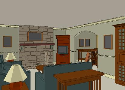
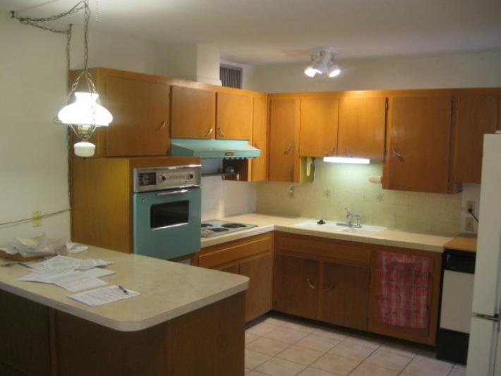
The living area of this 1960s era 1400 sq. ft. 3 bedroom, 2 bath ranch house, as shown in the first three images features a walk-in living room, open to the formal dining room and a closed off 9’-6” x 12’-6” kitchen. This layout, common not only to ranch houses but to many homes of the era, evolved from the work-only post WWII kitchens that placed Mom toiling away in the kitchen, separated from the other activities of the family.
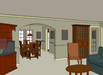
The kitchen is surrounded by structural walls since roof trusses that eliminate the need for load bearing interior walls were not yet commonly used. So any eliminated interior wall needs to be replaced with some sort of support.
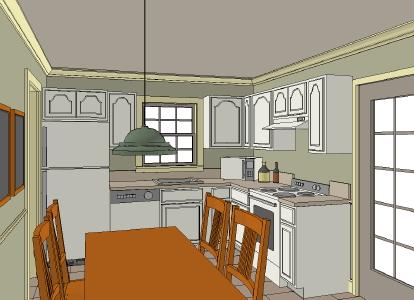
The existing kitchen is extremely tight, its layout is very much like its historic predecessors except that a breakfast table has been designed into the kitchen. ALL meals, except the most formal, are eaten here. Dishwashers were the ‘must have’ new appliance of the era, and the now indispensable microwave showed up later but ate up lots of valuable counter space.
Note: Just for the record, the size of the kitchen is NOT important to meal quality. This kitchen can still cook any meal that can be imagined as any professional cook can prove!
Now its time to create a kitchen/living area that’s suitable for today’s fast paced two income family. Mom is not the servant she used to be. Meals are fast during the week, celebrated on the weekends. The flat screen TV is over the fireplace and louder than ever. And the computer is integrated into the hub of family life. Different families will prioritize various design ideas, though most start with the desire to increase the size and livability of the kitchen. The design sketches below show how different wants and needs can generate completely different kitchen renovation solutions.
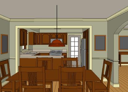
The most obvious way to open the kitchen up to the dining area is to simply remove as much of the wall between them as possible. Then soffits and cabinetry are installed in a U-shaped peninsula design and the breakfast table is removed to create more storage. Now the dining table becomes the only eating area. Wood flooring unites the living and dining room, but increases the noise level.
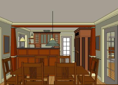
This kitchen renovation uses KWF instead of cabinetry and adds double French doors between the living area and the new kitchen/dining area to control the sound when desirable. By closing the doors, the dining room area is isolated from the noisy TV and can even become a home office by using the corner computer desk/armoire (out of site) and the table. To add more light and direct access to the rear patio, a patio door has been installed in the kitchen in place of the tiny window. The workstations eliminate the ‘laboratory’ look of a typical kitchen and hide the messy counter tops from view, great features for formal dinner parties.
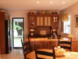
Here is an example of a modest Cape Cod Bungalow that was remodeled with workstations instead of cabinetry. It is very similar in size to the kitchen renovation shown in the sketches above.
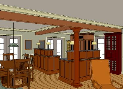
This design combines all three living areas into a unified great room by removing all the walls and installing the beams and column. The kitchen area is seen from the front door, so the KWF design allows the messy kitchen view to be partially blocked. Views to the front and back of the house are visible from all areas, enhancing the openness of the plan. The Formality of the KWF coupled with the Informality of the open-plan creates a very versatile room, however sound privacy is compromised and therefore must not be a priority for this plan to be successful.
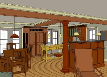
This plan features an expanded kitchen with a center Worktable. Key to all the KWF plans is the Refrigerator/ Armoire that features a concealed 36” wide refrigerator flanked by full height pantries. These pantries take the place of the typical above-the-countertop wall cabinets. The sink and range workstations are super efficient because they are extra deep, eliminating the need for endless runs of 2 ft. deep countertop and base cabinets.
Can you see the difference? See how the continuity of the wall, floor and ceiling surfaces that go between ALL the pieces of furniture unifies the ENTIRE room? Can you see how the sculptural, three-dimensional qualities of the furniture are so different than normal cabinetry? Can you see how the colors and textures of the pieces can be different, enhancing the one-of-a-kind appearance of the room? And how not seeing the appliances contributes to a more comfortable, less technical look?
We hope that this article shows you that even smaller homes can be designed with KWF, if it is your desire to create something very special! With over 250 models and dozens of styling options from which to choose, we are certain that KWF is worth considering for your next kitchen project. So please call us and let us help you find the plan that is just right for you.

