A Movable Kitchen
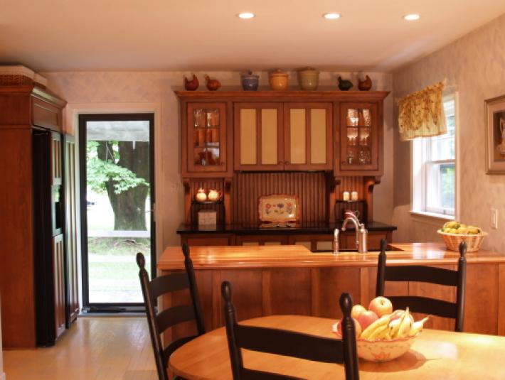
This modestly sized, Cape Cod style home has been transformed into a very personal home. The owners who are now empty nesters are still planning to increase the size of the house so that it will suit their needs well into the future. But initially they had tackled many of the early renovation tasks themselves. However, when it was time to do the kitchen, they chose YesterTec to help them. As they were thinking long term,they knew that they would need to have a movable kitchen since at the time the kitchen renovation took place they had not developed final house plans. So they chose the Workstation concept because of the lasting quality and the movability of the pieces.
Moving your kitchen is not a new idea. In the days when kitchens only had a built-in cooking source, (a fireplace or cook stove) all of the other workstations were pieces of furniture. Cupboards, tables, pie safes and dry sinks could all be moved from house to house with their owners. Then, indoor plumbing, gas and electric appliances eventually brought the built-in cabinetry that is still ever so prominent today. Movability is not a priority or even a consideration for our modern kitchens. When you move, you leave your kitchen behind, to be either accepted by its new owner, or destroyed to be replaced by another built-in in design.
Not so in Europe, where modular cabinets that hang on universal mounting systems can be moved from house to house. So often (as shown on House Hunters International) American buyers are so bewildered when they walk into a continental home for sale that needs an entire kitchen!
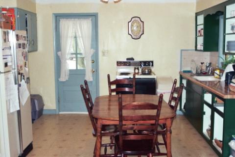
The above image shows the existing 12 ft wide by 18 ft long kitchen. The exterior door is the entry door that is most used by everyone. This entry situation was another reason the owners chose the workstation concept. They felt that entering a room that was ‘furnished’ would be a better way to greet their guests than entering into a standard kitchen. The idea of concealing the major appliances as well as all the countertop clutter was imperative to achieve the look they desired.
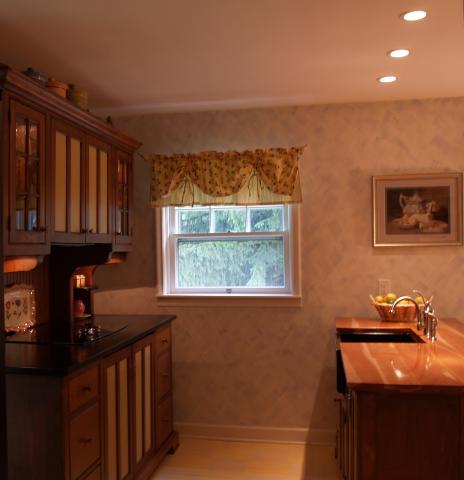
After comparing designs from many kitchen suppliers including Home Depot and Lowes, they found YesterTec to be the most cost effective company that could meet their goals. Not only could the appliances be safely hidden in the U.L. Listed workstations, but the installation costs were far less than the other companies since the YesterTec products arrive on site in a more completed state than normal cabinetry.
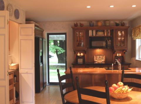
The success of the design is due to its simplicity. Only three workstations were used, insuring an un-crowded appearance while providing plenty of storage and counter space due to the extra depth of the 30” deep workstations. With only three workstations, the existing radiators, 4 doors and 2 windows could remain in place and there would still be many places to add personality to the room with art work above, aside and within the furniture. The soft yellow painted wood floors and walls featuring light blue design accents function as the ‘glue’ that holds the entire ensemble together.
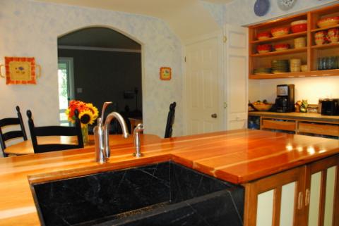
Another key feature of the design is the Working Pantry located behind bi-fold closet doors. This utilitarian work area conceals all the small appliances while providing a large usable countertop and plenty of storage for food and dishes.
The three workstations are made of distressed Colonial Pine, and feature solid cherry and soapstone countertops in addition to the soapstone apron front sink. The oven, microwave/hood and standard dishwasher are concealed with pocket doors connected to YesterTec controls that only allow the appliances to operate when the doors are safely stored in their pockets. Drawers feature 25” deep full extension undermounted slides. Top cabinets at the range are 18” deep.
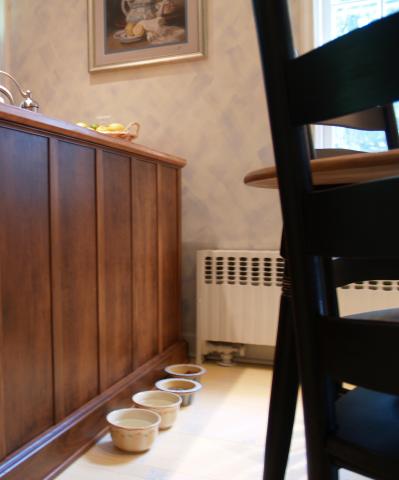
Everybody Eats!
David Beer, the founder of YesterTec says “This kitchen exemplifies why we developed our workstation line in the first place! We wanted to offer an alternative to standard kitchen design that would make a real difference in how a kitchen is perceived and used. We wanted to reduce the size of the kitchen while enhancing working efficiencies in entirely new ways. We wanted to present a concept that wouldn’t rely on quantity and overwhelming size to make a significant design statement. We wanted the kitchen to really look like ‘a room for living’ instead of a laboratory. As it turns out, making small kitchens that have the ability to blend into multi-task living areas is a very current and ‘Green’ concept that can reduce the size of any design. And reducing square footage means saving materials, labor and energy. Finally, we wanted the concept to be timeless, and by making modestly styled furniture that can hide the appliances and can be moved, these workstations will perform well in whatever new design the owners chose as their home expands in the future.”
