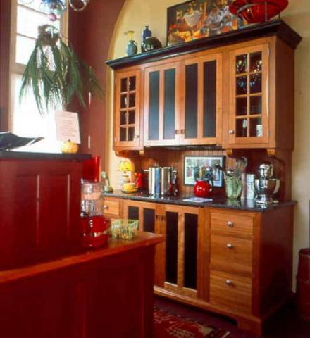
The purpose of Designer’s Guide Part One is to familiarize designers (both professional and non-professional, in other words, YOU!) with Kitchen Workstation Furniture, the revolutionary, alternative approach to kitchen design.
The format of Designer’s Guide Part One (as presented by David Beer, President of YesterTec Design Company) consists of design theory and real examples that will reveal tools that you can use when creating your next kitchen! At the conclusion of the presentation, I hope you will think of Kitchen Workstation Furniture as not just a trend, but as a different and exciting design concept for kitchens
The Kitchen as a Collection of Furniture
Every once in a while, someone comes up with an idea that makes so much sense that you can’t understand why it has not been thought of before. “Unfitted kitchen furniture” that has recently been promoted by the English designer Johnny Grey as well as other cabinet designers and manufacturers may well be one of those ideas.
By re-defining kitchens into pieces of furniture, a previously popular but currently under-explored area in kitchen design has been re-discovered. Furniture is an appropriate concept for America’s kitchens because it allows us to personalize our kitchens, to mix styles creatively, and to carry the design themes of other rooms into the kitchen.
You will see several images that do not show exposed ovens. That is because YesterTec’s U.L. Listed technology allows the ‘hot’ appliances to be concealed when they are not being used. Though most cabinet manufacturers have been concealing refrigerators and dishwashers for decades, YesterTec is still the only manufacturer that has a U.L. approval to conceal the ‘hot’ appliances.

1. An example of Johnny Grey’s highly stylized work that he designed for Smallbone, an English manufacturer, is shown above. I thought that this concept would be great for the American market, if a more flexible styling could combine with larger standard American appliances.
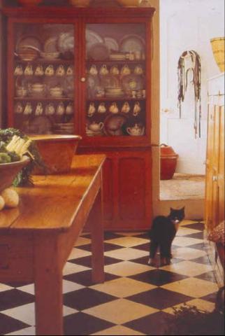
2. During this presentation, I plan to reveal what the concept of working furniture in the kitchen can do for you. I hope to show you how it can even save square footage, by creating a room that is more than just a kitchen. You’ll discover why ‘The heart of the home’ can be more like a living room than a kitchen.
The presentation includes:
- Examples from various manufacturers and designers.
- 3-D CAD renderings that will help to explain theoretical concepts.
But most importantly, remember, this truly is not rocket science!
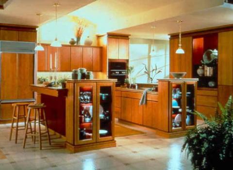
3. First of all, I want you to relax. I’m not going to tell you that traditional inline kitchen design is wrong, inadequate or even inappropriate. Inline cabinetry design can get the job done in any space. It is efficient, flexible, and most importantly, the standard that people can relate to. It is recognized as ‘The method” therefore it is easy to talk about and sell. But as an alternative to inline design, workstations can do different things that simply can’t be done with inline design. Better or worse is not the issue here. Appropriate for the design problem presented is the issue.
So… RELAX!
First, get rid of your inhibitions. For now, ignore the kitchen design standards you know, they will be important to use later. You can probably make an argument for every point I make here, but if you are thinking in that direction, you’ll miss the point. You need an open mind to discover how simple workstation design is.
I’m going to start right off with an opinion that should help you to relax. I personally feel that workstation design is best suited only for kitchens that need to be more than just kitchens. I think they are best suited for kitchens that blend with other rooms such as family rooms, dens, great rooms.
In addition, kitchens that are only kitchens need to be big. Lots of space. Having said that, I’m going to show you some examples later that will blow these statements right out of the water. The point I’m trying to make here is that each of you, if you let yourself, will come up with some very different ways to use workstation design. There are only a few, very flexible rules, so your imagination will be the only limiting factor when designing with workstations.
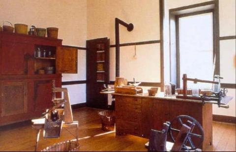
4. Here is my favorite design tip: Design a beautiful room, then furnish it! This is an early example of that concept. It is a classic Shaker room, where movable furnishings have been placed to accommodate the tasks of the time. This room epitomizes the current phrase ‘The kitchen is the Hub of the home’! The walls, flooring (and ceiling) surround these pieces that have sculpture-like qualities. NOTICE THE LIGHT AND SPACIAL PURITY OF THE IMAGE ABOVE!
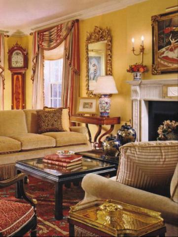
Design a beautiful room, then furnish it!
5. Furnished Kitchens are designed just like the other rooms of the house. Notice the vertical elements in the design (wall, window and fireplace) and the floating furniture. A Furnished kitchen will use the wall spaces between the window and fireplace for tall pieces and float island pieces in the middle of the room in the same manner as the sofas are used here. The unifying finishes of the walls, flooring and ceiling surround these pieces that have sculpture-like qualities.
Before progressing too far, lets define the various types of kitchen concepts.
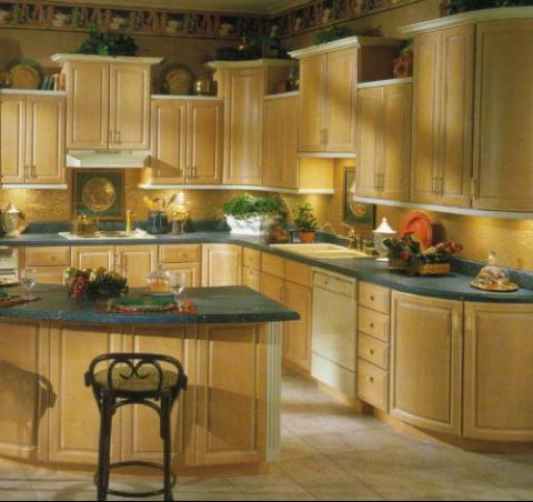
6. Inline or ‘standard’ kitchen design typically has the following characteristics: Long runs of continuous cabinetry and countertops.
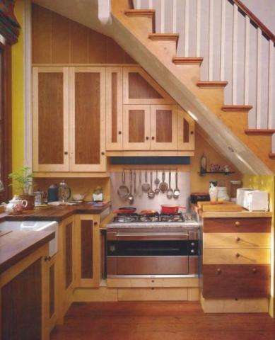
7. Unity is accomplished because the cabinetry and tops have one color, any configuration can be achieved, any space can be filled and exposed appliances create focal points and visual breaks
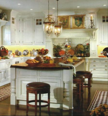
8. Inline design relies on the continuity of the cabinetry to create a wall ‘texture’. This ’texture’ allows the composition to be successful no matter what shape it assumes. Within the composition, there is very little opportunity to personalize the design. Typically the backsplash area is the only area that is available. If the countertops are used for display, their efficiency as a work surface is compromised.
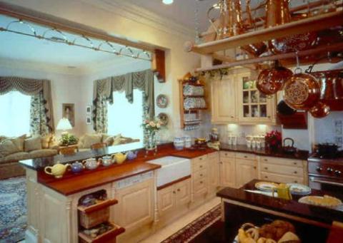
9. Inline design is difficult to assimilate into open plan design because it uses a completely different set of design rules. The ‘furnished’ area is separated into vertical elements of wall space, windows and doors, whereas the Inline kitchen is separated into horizontal elements. From this view, the ‘furnished’ living area has one design theme and the kitchen has another.
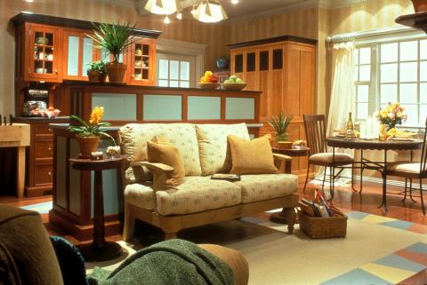
Furniture
10. I really don’t know if the English called cabinetry ‘fitted’ furniture before Johnny Grey coined the phrase “Unfitted” kitchen furniture. But for now, we’ll use Johnny’s term “unfitted furniture”, or kitchen workstations, or kitchen furniture or pieces to describe individual free-standing compositions of cabinetry, appliances and tops that are completely separated from each other. Notice how the furniture fills the vertical spaces between windows and doors. Walls, ceiling and flooring surround each balanced and proportional, 3 dimensional piece.
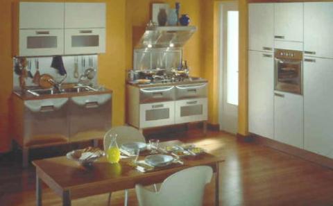
11. The styling of the ‘pieces’ can vary, depending upon the desired design theme. Here two pieces are combined with a wall of built-in cabinetry, but again, the walls, flooring and (ceiling) act as the ‘glue’ that binds this open plan design together.
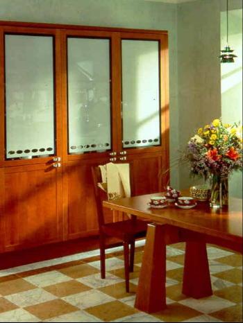
12. Furniture pieces that are typically found in all the other rooms of the home can blend seamlessly into kitchens designed within the same parameters. The continuous wall, flooring and ceiling textures are the key.
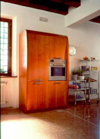
13. Generally, it is best to separate each piece with a vertical space (wall, window door, fireplace etc.) However, if adjacent pieces are very different, the composition can be successful. Here light and airy storage carts are adjacent to a large solid piece. Notice the continuity of the walls, flooring and ceiling textures.
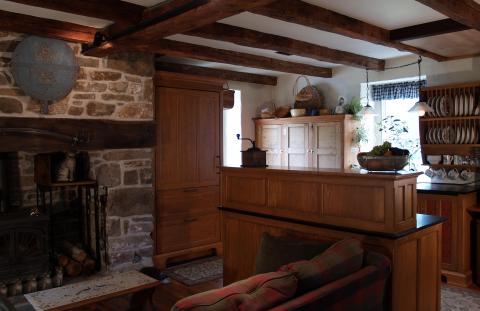
14. In this country kitchen design, a large fireplace is the focal point. Kitchen Workstations are placed between the fireplace, windows and doors, preserving a cozy seating area in front of the fire. The furniture pieces conceal the ‘tech’ look of the appliances and hide the messy countertops, maintaining the period design of the room.
The Unfitted Furniture Look
15. A concept that is somewhere between the other two, we’ll refer to it when there are vertical cabinetry elements that break the continuous line of cabinetry of Inline design.
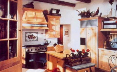
16. Controlled Chaos! Typically, there is no space between the horizontal elements and the adjacent vertical elements. Many times there is a depth or height change of the vertical element when compared to its neighbors. Color or texture of the vertical piece can be different as well.
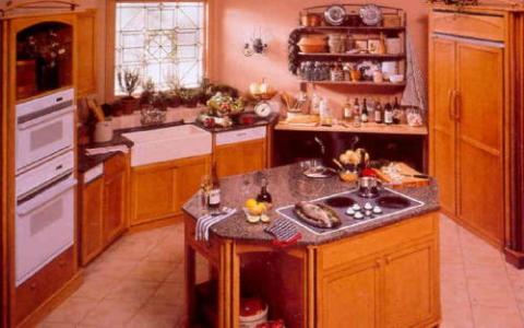
17. Here, the black ‘baking table’ and the wall rack act as a break in this design, but there is no open space between the elements. The refrigerator on the right is concealed in a ‘furniture-like piece’ as well, its details reflected in the oven cabinet on the left. Even the island has furniture qualities, but because the pieces are directly adjacent classifies this kitchen as a ‘Furniture-look’ design.
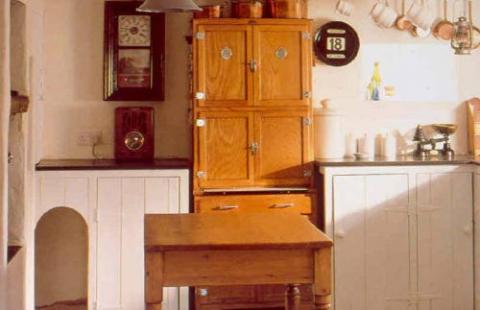
18. This great example of a ‘Furniture-look’ kitchen combines an actual piece of furniture into an understated line of built-in Inline cabinetry. The lack of top cabinets allows a great degree of personalization in the open wall spaces. The complementary finish of the antique work table brings continuity to this room as well.
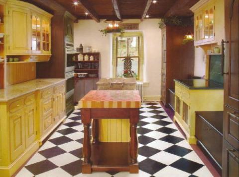
19. This ensemble appears to be separate pieces of furniture that have been jammed together. Its success is due to its restrained color palette and the alternating large/small massing of the individual pieces.
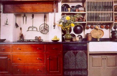
20. Here, three different tasks have been separated vertically to look like real pieces of furniture, but because they are all joined together, we’ll call this the ‘Unfitted furniture look’.
(A Brief) History of furniture in kitchens
Lets just keep this simple: I believe that history has a precedent for everything we do. Our basic human needs have not changed all that much over time. We still need food, clothing and shelter from the elements. Throughout the millions of years of the development of man, these simple needs have not changed But in the latest blip on the time line, the blip that we live in, from the industrial revolution on, man has become intimately involved with technology. Technology has redefined our “needs”. Johnny Grey in his book The Art of the Kitchen, goes into great detail about the history of the domestic kitchen. Like most everything else, the transformation from campfire to today’s kitchen is defined by technology.

21. The early predecessors to today’s kitchens focused around the fire source. In this English cottage kitchen (still in use today), a built-in iron fire insert, complete with oven and hot water heater is featured with a separate built-in sink area. Other furnishings in this room define it as the ‘Hub’ of the home where many activities occurred. Both pieces are separated by wall and floor areas.
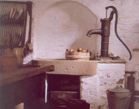
22. This kitchen features an early example of how water finally was supplied directly into the home. Prior to this, water was bucketed in from an outside source. Notice the work table and the plate rack to the left. Both are independent of each other. The spaces between these elements allow for other smaller items (here assorted containers) to be placed. All the elements combined have an impromptu sculptural quality.
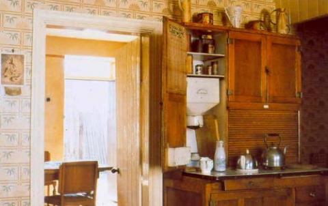
23. Here is an example of one of the first mass produced pieces of kitchen ‘working furniture’. It was called a ‘Hoosier’ and many are still in service today. It was originally a baking center, when the production of bread was still a home-based chore. In its heyday, the only other items in the kitchen were a sink, an icebox and a cooking source, typically a coal or wood cast iron stove and later a gas range.
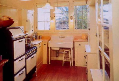
24. This is a newly renovated (but retro style) kitchen in a ‘bungalow’ style house. Notice that the sink and range are independent pieces, but cabinetry is starting to fill the gaps between the utilities. This is a great example showing the integration of cabinetry directly into the kitchen. Prior to this, cabinetry was typically only found in the butler’s pantry.
To the right, two ‘furniture like’ cupboards still exhibit some of the characteristics of independent pieces of furniture. The storage capacity of the tall cupboards allows the remainder of the kitchen to remain quite open, negating the need for upper cabinets everywhere.
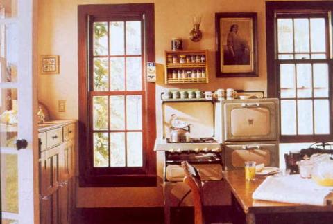
25. The resurgence of Kitchen Furniture is an exception to the normal chain of events that has created the in-line kitchens of today. Technology has not created it. Rather it is the result of a conscience effort that says NO to the format of the in-line kitchen. It has resurfaced because someone took the time to question the way things were going. Someone took a step back and found a jewel that had been neglected for a long time. Without rejecting technology, an entirely different way of creating a kitchen environment has been rediscovered simply by separating functions once again. In this example, note the abundance of light that the large windows bring into this room. Note the pictures on the wall. By separating the ‘furnishings’ the kitchen can have all the room defining characteristics of the other rooms in the home.
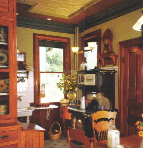
So let’s find out how workstation design really works.
26. There really are only two main features to consider:
- The autonomy of the individual pieces
- The spaces between the pieces
- But the spaces are the real key. The spaces define the room.
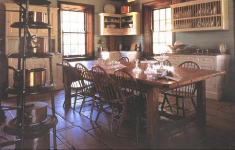
27. Seeing the continuity of the architectural features running between the pieces allows the character of the room to be un-compromised. Soffits and wing walls do not break up the lines of the room. Crown molding, chair rails, peg rails, paneling, wainscoting, and bases that appear between each piece remind us that the design is part of a larger whole. In log homes, seeing the logs between each piece keeps the continuity of that structure intact.
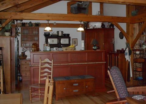
28. Seeing the post of a post and beam structure go all the way to the floor between the pieces of furniture keeps the order of the structure intact.
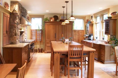
29. Designing with Workstations is a completely different approach to kitchen design. It is the ultimate 3-D design experience! Here, separating each piece from one another allowed the designer to bring in a lot of light and preserve the character of the room. It’s the spaces that allows this to occur. The spaces are the unifying element in the design.
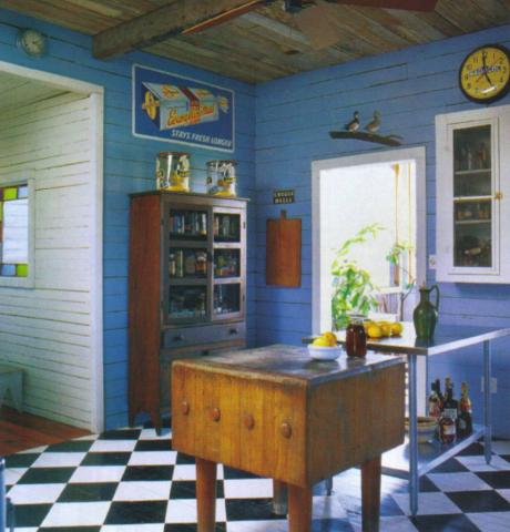
30. Here, separating each piece from one another allows the designer to mix different styles, colors and materials. Look at the butcher block next to the stainless steel cart!
Again, it’s the spaces that allows this to occur.
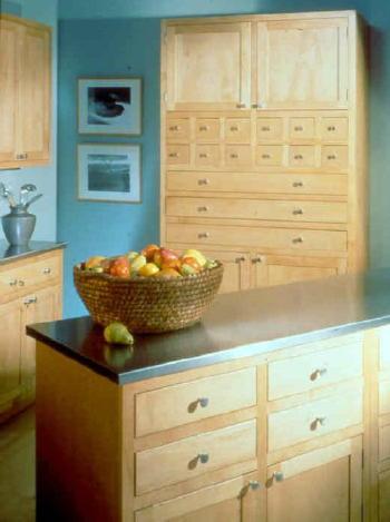
31. Conversely, the individual pieces do not always need to be so different! An understated room design can be quite successful by using a collection of furniture pieces with similar features. In this case the spaces between the units are used to provide diversity.
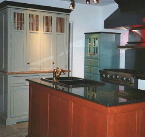
32. Varying the heights and depths of the individual pieces is recommended whenever individual pieces are in a tight arrangement. When pieces are located on the same wall, varying the sizes is mandatory.
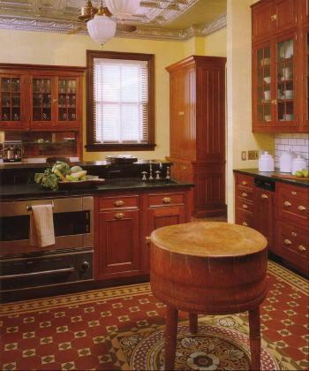
33. You can even use workstations as accent pieces to blend in with more traditional in-line cabinetry. Sometimes just one or two pieces can combine with existing cabinetry to transform an older kitchen into an exciting livable kitchen. The pieces’ sculpture-like qualities are maintained because the walls, ceiling and flooring surround each piece.
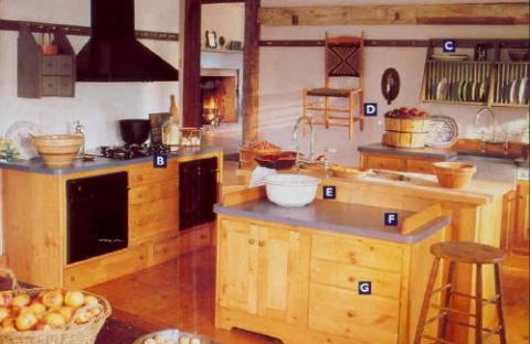
34. This Shaker Style kitchen is a great example of how the spaces can be used to enhance the ‘personality’ of the design. There are many colors and textures in this room, but it is the wall and floor treatment that function as the ‘glue’ that holds the whole design together. The continuity between an adjoining room (in the foreground as shown in the next photo) and the kitchen is not cut off at the edge of the cabinetry as the room’s surfaces flow in and between the units.
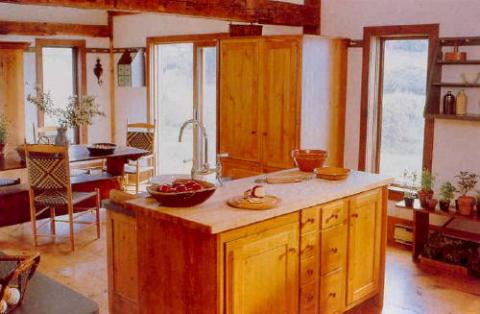
35. It is best to have a maximum of 2 to 4 major pieces in the kitchen, separated by minor (shorter or shallower) pieces or large architectural features (door, window, built-in shelving, fireplace etc.) The play of heights and depths guarantees the variety that is necessary. And the more low units the better. Island units function like the floating furniture in typical room design.
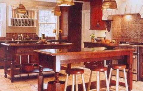
36. The volume of the pieces are an important consideration too. It is better to mix pieces that have legs into the composition than to design a composition that only has full volume, bulky pieces.
Tables, carts, baker’s racks, open shelving and chopping blocks are great open volume items to design into the composition. Get creative!
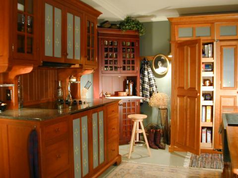
37. The Autonomy of each piece allows some very interesting things to happen when compared to Inline design. First of all, the pieces do not have to match each other in any way. Style, Size, proportion, color, texture, finish, and the symmetry of the pieces can vary. The balance of the individual pieces is not overbearing as smaller pieces are placed between larger ones, and the wall color holds the whole design together. You, however, may want to establish a theme, in which you may want the pieces to be very similar, or you may want an eclectic look that mixes influences creatively. The ensemble must be balanced however, which again has to do with the sizes and arrangement of the pieces in the room.
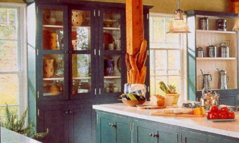
38. The balance of the design and of each piece is required to make the design flow. Balance allows each piece to be easy on the eye. Conversely, if each piece is extremely intricate to the point where the eye gets stuck looking at certain details, the whole design will be uncomfortable to the eye. vA room full of very ornate pieces of different styles will be less successful than a room with simpler pieces that share some common features. Remember that when you are creating a room setting, you are creating a whole look. The workstations do not necessarily have to be the main statement in the room in order for the design to be successful.
In fact, this is a very important point! Many times, the most successful design will feature us, the users, and the room and furniture will simply be our stage set.
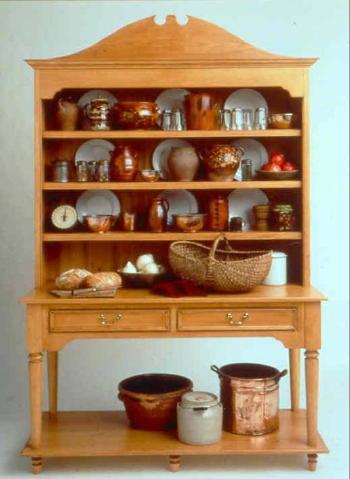
39. On a smaller scale, balance has to do with detailing and weight. Furniture must look as though it is supported from the ground, not hung from the wall. Its weight should be recognizable. This does not mean it must look bulky and heavy. Styling and color will determine the appearance of light verses heavy weight. But its gravity must be recognizable. Furniture must have a base, a top or cornice and a minimum of two finished sides. An individual piece of furniture is a 3-D object. It needs to be designed as if it were a piece of sculpture. And this is perhaps its biggest departure from inline design.
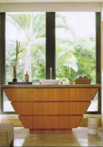
40. Style, Shape, Materials and Colors can all vary, as demonstrated by the images above and below!
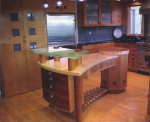
BUT BEWARE!
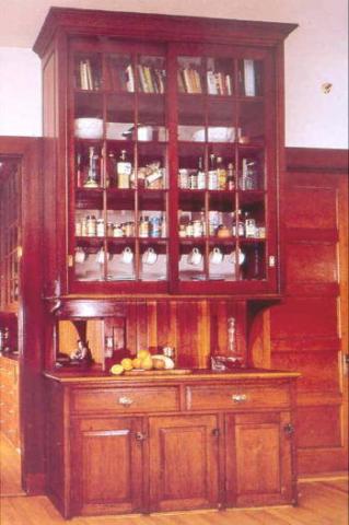
41. There is a careful balance when considering size and proportion!

Let’s talk about the Construction of workstations:
42. Typically furniture is built differently than most cabinetry. Most importantly, its movable. It must be tougher and stronger than cabinetry because it can potentially move several times in its lifetime. It is more 3 dimensional. It does not need to be made of box modules and attached panels. It can be made as one unit, with no joints where boxes join together; side panels can be integrated into the framework rather than attached to the side.
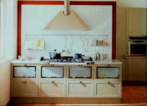
43. However, furniture can be built with all modular components as long as the finished piece is unified. The European manufacturers have actually been taking this approach for years, creating interchangeable modules that can be swapped as your needs change.
A word about Countertops
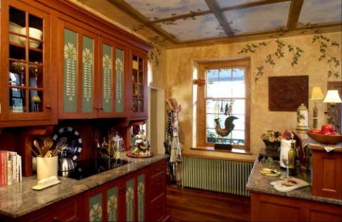
44. Remember that since you are creating individual pieces, you can allocate different countertop surfaces to various tasks. Stone or stainless steel tops near the cooktop and ovens allow hot pots to rest directly on the surface. Solid surface composites, stone or stainless steel work great near the sink. Marble can be used on a piece that is to function as a baking center. You may even use laminates as a multipurpose tops, but you can change colors and patterns to define the individual pieces.
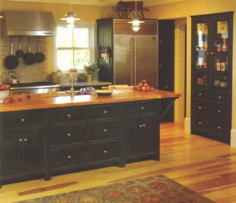
45. Or, for the ultimate furniture look, there really is nothing the beats the look of natural wood, and there are extremely durable finishes that can be used on wood tops that make them quite practical for kitchen use. The point is, you can use different materials for functional as well as visual requirements, and with care, you can blend them into the same kitchen, something that is difficult to do in an inline kitchen.
