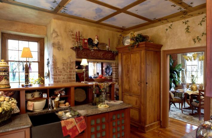
The Heart and Soul Kitchen
The Interview
Michael Walsh, a contributing writer for Better Homes and Gardens S.I.P’s interviewed David Beer, president of the YesterTec Design Company while he was compiling research for an article that he wrote for the Kitchen Planning Guide 2001 entitled The Heart & Soul Kitchen. The following is the list of his provocative questions and comments followed by David’s thoughts/reactions concerning the ‘heart’ of our homes.
The resultant article hit a home run for the ‘quality lifestyle’ kitchen that YesterTec promotes.
Premise:
Are we designing kitchens for contingencies–the rare big-deal dinner party, the holiday feast–AT THE EXPENSE OF every day comfort–physical, visual and emotional comfort. Is the emphasis, too often, on accommodating machinery, rather than meeting genuine human needs?
The major reason for the ‘bigger is better’ trend in housing is to acquire and show off consumer goods. All these trappings are then ‘stored’ openly in rooms, or hidden away in cabinets, closets, attics and garages. Few of these items are needed to sustain life, but many are used to define our ‘lifestyle’. We are not the first society to be defined by our lifestyles, but we definitely have far more choices to make to determine our own personal style.
If we were to step back and examine our lifestyles for meaningful content, I’m sure most of us would agree that we need to simplify our lives. But who does that? There should be (and I’m sure there are) consultants to help us attain simplicity for those who are stuck in this complicated consumer driven culture.
What, beyond cooking, is a kitchen for anyway? What is its role in household life? What is the meaning of a kitchen?
In a busy household, the separate living room and dining room are rarely used if there is a family room/kitchen/ breakfast room. The kitchen gets the most traffic. It’s like the hub of a wheel that sends energy to the tires. I think of the kitchen as the communication room. If a family is still determined to observe the most important ritual of the day, the family dinner, it is usually in sight of the kitchen. It is a gathering room for our daily schedules or a stage for our daily dramas. It’s where children find mom and dad. Kids play in it or nearby. It’s the modern foyer. A drop off point for everything as it is usually the informal entrance for the family. Every house I know functions this way.
Might we be better off regarding a kitchen as a living-room-with-plumbing rather than a hyper-utilitarian space? If we spend so much time in the kitchen, why not make it seem more like a multi-functional living room?
Exactly! That is why YesterTec was created. Our workstations downplay the appearance of ‘kitchen’ in favor of the appearance of ‘living room’ by using the time enduring concept of furniture. The Spaces between the pieces are the most important feature that makes this concept seem more like a room than a kitchen. The spaces hold the key to the personal expression of the homeowner. Give 3 different homeowners the same room and the same furniture to use, and they will fashion 3 different looking designs, all done by handling the spaces differently.
Few seem to want to carry the simple expression of their personal lives into the kitchen. Simple designs for living in this age seem to be missing. Space for a rocking chair, or simply a stool with knee space under a counter so that prep work can occur while sitting was always available in ‘furnished’ kitchens, but not in today’s ‘built-in’ kitchens.
Where have we gone wrong and how can we do better to make kitchens more responsive, more genuinely the heart of the home?
Make it comfortable. Create places to do office and homework with variable storage solutions not just for food and pots and pans. Use comfortable dining chairs, similar to the chairs in an office, where people can eat, study or lounge in them. Think of the most comfortable dining chairs you’ve ever experienced, and put them in a domestic kitchen.
Make it less like a laboratory and more like a room. Use proportional design once again. The laboratory look typically works because there are only a couple of materials and colors to integrate the unbalanced composition of cabinetry and appliances into a whole look. Typically, this is not how other rooms are designed. The features of other rooms; walls, floors, ceilings, windows and doors become the unifying factors, and the furnishings and artworks personalize the room and define its ‘character’.
Appliances: Overkill? Commercial-caliber appliances? Double ovens, dual dishwashers, 48 inch wide refrigerators. Do we need those industrial-strength elements? Why do we want them? What are we giving up in order to have them?
For most people, the high-end appliances are bought because they are promoted heavily by multi-national conglomerates who have to change concepts and features often just to maintain markets. People buy what they see on TV, sometimes without thinking ‘will this make my life better’. Keeping up with the Jones is real. Need is not the question. Most bottom line appliances will cook very well.
A few exceptions; appliances such as the microwave oven and the food processor truly revolutionize cooking, but true innovations are few and far between.
Cabinets: Are we over-stuffing our kitchens with storage (and really costly storage at that)? What are the alternatives: 1) putting some storage in dining area or family room? 2) Devoting more space to a separate pantry, less to the kitchen itself?
Most kitchens except the very smallest, will be better designed with some sort of a multipurpose pantry, for common as well as rarely used items. Closets are much cheaper than cabinetry for this type of storage. This is the time-tested solution that existed before storage cabinets invaded the kitchen, and it still works.
Stuff: Do we have too many rarely-used small appliances (the pasta maker, espresso/ cappuccino maker, the juicer, the bread machine, juicer, waffle iron); too much china and glassware, too many rarely used place settings? Do we ever use the gravy boat, 30-cup coffee maker, silver tea service, the punch bowl, the turkey roaster, the oyster plates, all those wedding-present items? What are we giving up in order to hold on to those never- or seldom-used things? What are some alternatives to having all that stuff and/or storing all that stuff?
There are homemakers who really use gadgets that are required for specialized cooking, but in general, great meals require few tools. The question also involves time. If you have more money than time, then gimmicks make some sense. It takes money to buy them, expensive space to store them, but they may save time to use them.
Materials: Landing strips of granite, stainless steel, plastic laminate–are these in a way alien materials, even if they are low maintenance or impressive to look at? Why are we relying so heavily on such synthetic or impervious surfaces? What materials can we use instead and what will those materials do for us and the kitchen?
Most countertop surfaces should be impervious to germs and easily cleanable and durable. But the quantity of these expensive tops is highly questionable.
There are thousands of kitchens in Manhattan that have no counter tops at all!
Generally, in medium to large kitchens, there is too much counter space that is filled with stuff. At least a third of the depth of 2′ deep counters is useless as food prep areas.
Why not have less expensive materials on areas for stuff on counter tops that do not need the food prep characteristics. (separating kitchens into furniture does this.)
Floor plans: Cooking vs. eating. Should we be devoting more space (energy, thought, resources) to dining/gathering/sharing/interacting/lingering and less to cooking? What should an everyday-kitchen floor plan look like?
In the same way that Air-conditioning and TV killed the front porch, The kitchen Work Triangle killed the living-room kitchen. Taking as few steps as possible while working in the kitchen dictated the efficient laboratory look. (Understand, the steps saved in the kitchen are ultimately used up at the gym on the tread mill, now that really makes sense!) Why not take a few more steps in an environment that is soul soothing, rather than face the traffic on the way to the gym?
Time is now a major player in the development of kitchen plans. To spend an hour cooking only to eat in 15 minutes is one type of lifestyle. To spend 5 minutes micro-waving dinner that is eaten in front of the evening news is another. But to plan a living room/kitchen that functions well for many lifestyles generally means a closer integration between cooking and eating/living spaces. Bringing a lounging area into the kitchen will do the trick. Many will have the multi-media entertainment center as well. Others just need conversation area. The point is to make the communication room more versatile in times that are not used for typical kitchen duties.
The noise of food prep and clean-up can also be a detriment to combining kitchen and living areas. Usually, noise can be controlled in ways that don’t isolate the cook from the family.
Furnishings: Too many rigid/static built-ins and not enough brought-ins (hutch, armoire, sideboard, sofa, chairs)?
The brought-ins carry on the design techniques that most of the other rooms in the house use. However, when used in kitchens, these items must be far more durable and spatially efficient to meet the requirements.
Lighting: Too much emphasis on task lighting, too little on mood-setting decorative lighting? What can decorative lighting do for an extended, open-faced kitchen? What can it do for the people who occupy that space?
Decorative lighting can completely change a day-time setting into a completely different night time setting. But living rooms usually have very simple lighting schemes, involving lamps used for reading, sconces for general lighting, down lighting and spots for accents. These same strategies can be integrated with or replace the lighting that typically floods our kitchens and surrounding rooms.
Personalizing: Is there room in a kitchen for artwork, collectibles, prized possessions, mementos, souvenirs, heirlooms? What effect can such elements exert on a kitchen?
Personalized wall space created by creating spaces between workstations is again, the key feature that furniture brings to open-plan design.
However, reducing top cabinets in lieu of a full height cabinet and/or pantry will also free up wall space that can be used for personalization.
Soft goods–Is there room in a kitchen for textiles, beyond dish towels and place mats? Curtains, cushions, pillows, upholstered pieces, area rugs, runners? Does everything have to be waterproof and wipe-able?
Most things exposed to greasy air should be cleanable. They cannot be near any appliance that heats. But otherwise, these softer items help define the character of our other living spaces, so why not bring them into the kitchen?
PLEASE DO NOT QUOTE OR COPY THIS ARTICLE WITHOUT PROPER REFERENCE TO MICHAEL WALSH.


