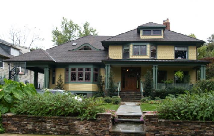
Craftsman Style Kitchen
Editor’s note: This home is a gem! Every room is perfectly crafted and appointed and is a true testament to the Arts and Crafts or Craftsman Style without becoming museum-like. Both inside and out, this family home lives bigger and more comfortably than its small lot would seem to allow.
Perfectly sized ‘Rooms for Living’ were created when a new dining/library, porch/lanai, master bedroom with bath and an enormous kitchen were added during the renovation of this exquisite Chevy Chase, Maryland home. The new addition that doubled the original size of the home blends in so well that it is difficult to determine what is old or new. During the design process, architect Cherie Mohr, AIA of Gardner Mohr Architects LLC, discovered that the original Craftsman Style details were just too wonderful to ignore, so she incorporated them into the new work as she embellished it with other features of the captivating style.
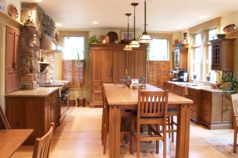
The owners knew that the kitchen was the ‘heart’ of their home.Even before the renovation, people would always hang out in the kitchen during social events. Their family life centered there too, as it often did in those older kitchens whose focal point was a cooking fireplace. So to capture the warming and nurturing appeal of a traditional fireplace (without actually building one) Mohr centered the production area of the new kitchen on a new stone hearth for the stainless steel range. The stones provide the warm ‘foundation’ for the rest of the room to build upon. The room also features a center island workstation, a custom designed prep table that accommodates six chairs for informal family meals. A table centered on the picture window focuses to the view of the backyard that features the new lap pool and the open porch/lanai. Great for entertaining, ten people can sit in the kitchen without invading the prep space of the cook.
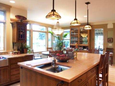
YesterTec’s Kitchen Workstations were selected by the architect to ‘furnish’ the kitchen. Separating the cabinetry into workstations that could conceal most of the high-tech appliances guaranteed a more ‘relaxed but formal look’ for the kitchen and allowed for larger windows to bring in more light. The refrigerator/freezer armoire located between two shuttered, room high windows handles dry food storage as well, reducing the need for endless lines of top cabinetry. The other workstations were designed by combining smaller YesterTec pieces to create larger compositions. The sink/ dishwashing area under the windows is extra deep, allowing for deeper storage under its expansive stone top. The Stainless steel range is flanked by the only built-ins in the kitchen, two small appliance garages that conceal normal countertop clutter, leaving the full depth of the base pieces for prep surfaces.

The furniture is handcrafted with stained quartersawn white oak and features Arts and Crafts details requested by Mohr. The mullions of the two glass doors on the cabinets flanking the window were customized from YesterTec’s grid design series to achieve the desired look. The Island contains a prep sink, butcher block top and garbage systems to handle all the fresh food prep. And the Table attached to the prep island with its ebony inserts was designed by the architect to be compatible with some of the existing details in the house.
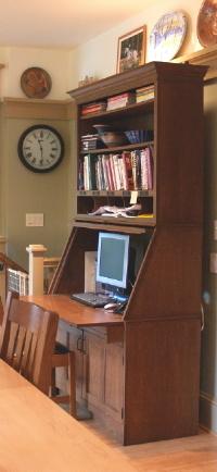
Once the kitchen was finished, the owners ordered one of YesterTec’s secretary desks that can conceal a messy desk surface when it is not in use. When it is opened, it reveals the kitchen computer while expanding the desk surface. Below a file drawer and space for a printer is concealed by Craftsman style doors.
The kitchen does not have the look of a typical ‘laboratory’ kitchen partly because the ceiling wall and floor surfaces are uninterrupted by soffits, wing walls and half walls that are typically found in kitchens filled with wall-to-wall cabinetry. Instead, it was designed as a beautiful room, with large windows to bring in the light, and then it was furnished. The high ceiling, tempered by the continuous plate rail separating the green wall color from the golden color above it, the contrasting light oak color of the flooring, and the detailing of the lighting down to the all the hardware contribute to the room’s success. It was a beautifully styled room long before the workstations even arrived. In essence, it was designed in the same manner as all the other ‘Rooms for Living’ in the house. They all were exquisitely crafted empty rooms, then they were furnished. A Simple concept really, and yet so foreign for most who are thinking about building a new kitchen. But this kitchen is testimony that the concept works in kitchens and with astounding success as well!
Credits:
Project Architect: Cheryl Mohr, AIA
Gardner Mohr Architects LLC
3626 Raymond Street
Chevy Chase, MD 20815
p. 301.654.9145
f. 301.654.6909
e. cm@gardnermohr.com
w. http://www.gardnermohr.com/
Photography: YesterTec Design Company
