Kitchen Trends: Is there a place for YesterTec’s Kitchen Workstation Furniture?
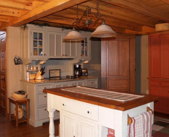
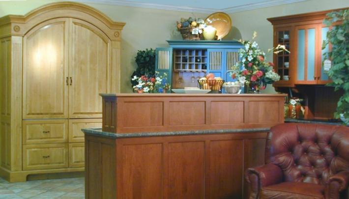
The YesterTec Design Company (YT) promotes a kitchen design concept called Kitchen Workstation Furniture (KWF) whereby kitchens are composed of a collection of independent, highly functional pieces of furniture in lieu of kitchens that are designed with continuous bands of cabinetry and counter tops. This concept is definitely not one of the most popular kitchen trends that you can think of, in fact it is and has been bucking kitchen trends for a long time.
YT’s founder, architect David Beer, created the workstation concept to help the kitchen more successfully look like the living room that it had functionally become. Most designers had already pegged the kitchen as ‘The heart of the home’, where most of the meaningful hours of family interaction occurred. And it was true for whatever family structure, and for any dwelling configuration, the kitchen had become the hub of the home. So by using the concept of furniture in the kitchen, the same concept that is used in all the other rooms of the house, a richer, more personalized room can be created that can bring many of the ‘living’ room features directly into the kitchen.
YT introduced the design community to this innovative concept back in the spring of 1997. After completing 2 years of research, testing and securing the U.L Listings and a patent for YT’s innovative technology that allows ovens, cooktops, microwave ovens and standard dishwashers to be concealed inside the furniture pieces or ‘workstations’, YT was ready to take on the world.
Ahead of the market
But an innovative concept supported with revolutionary products was not what the kitchen design world wanted to sell in the late 90’s. At that time, the big commercial stainless steel ranges that had been converted to residential models were all the rage, as they are to this day. And cabinet companies who had broken out of the white kitchen and pickled kitchen mode of the 80’s and early nineties, were busy producing door styles with lots of layered colors and textures. The ‘Old World’ look that made the cabinets appear as if they were centuries old was omnipresent. Refrigerator and dishwasher fronts had to be concealed behind cabinet doors. But the obligatory stainless steel range was prominently displayed underneath a room defining, baronial proportioned exhaust hood, a contradiction that just didn’t bother anybody and apparently still doesn’t!
Not the best time to come out with a mind bending new concept that conceals all the appliances! It wasn’t that the idea of furniture was a difficult idea to understand. I later watched a teenager explain the whole concept perfectly to her mother in a matter of two minutes! And furniture in kitchens had been prevalent throughout history once the kitchen had moved inside from the campfire. Most designers were already familiar with the concept commonly termed ‘the unfitted kitchen’ that had been coined by a creative English designer named Johnny Grey in the mid 80’s. His lectures and books were extremely well received, (even to this day!) but Americans still designed built-in kitchens, and now they needed to be bigger than ever. Johnny’s term just got watered down to the now ubiquitous ‘ unfitted look’, the catch all term used when designers cram a ‘furniture like’ cabinet into the typical long run of cabinetry and counter tops.
Quantity Over Efficiency
Quantity still reigns supreme over quality, when both don’t meet the budget. It is now almost mandatory to have yards of countertop and at least one stainless steel appliance even in a modest kitchen design. In a consumer society that still reveres the large single family home with two story high ceilings, castle-like front elevations complete with three-plus car garages, it is challenging to sell a kitchen that is anything but huge! But as most real cooks know, size is not best, efficiency is much better and that is the whole premise behind the Workstation concept.
Economy
Boom or Bust, the business is ‘Business as Usual’
And then perhaps our biggest obstacle, designers were busier than they had ever been due to the then booming economy, and now the kitchen business is promoting tried and true concepts in a weak economy. But either way designers really don’t seem to have time to promote a different concept, there seems to be little motivation on the part of designers to embrace a new concept that the public knows nothing about.
Training
Most contemporary designers have been trained to design kitchens with modular cabinetry that has been developed over the years to integrate with built-in appliances. Designs are typically horizontally oriented, and fill every available space with bands of upper wall and lower base cabinets, counter tops and back splashes ending only when they butt into a wall or wing wall. No other room in the house is designed this way. There is very little spatial difference between this type of kitchen and a commercial science lab!
Visually these kitchens actually work very well when there are very few colors and textures. Our other rooms tend to be more eclectic and open to diversity. Giving designers that opportunity is a main goal at YesterTec.
Boomers
The ‘laboratory’ format is what baby boomers grew up with and it is what they know. Boomers also have the most money now to create ‘dream’ kitchens, so manufacturers and designers are catering to their desires. And these are the kitchens that are published in the magazines. So now many kitchens, however modest, aspire to emulate the latest rendition of the ‘laboratory’ mega-kitchen found in the magazines.
YesterTec’s Customers
Though our customers have come from various age and income brackets, almost all have had one thing in common. They were looking for something different and did not want the ‘laboratory’ look. Though the refreshing idea of furniture was appealing to them, the efficiency and quality that is designed into each piece made the sale. Whether they purchased one piece to do a special job or an entire kitchen, these pioneers were definitely ‘Bucking the Trends’, and we thank them for it. If not for these intrepid folks, we would not be able to show you why KWF is a real design solution and not just a trend.
Summary
YT is a progressive company with the commitment to reveal KWF as a true alternative to using cabinetry in kitchen design. As we collect images of the kitchens that we have helped to create, we hope that you will find their stories inspiring.
The following are just a few of the themes to recognize in the images and articles on this website that will help you discover the virtues of a furnished kitchen..
- Watch for irresistible personalized uses for the spaces between the pieces (which can only occur in furnished kitchens)
- Watch for diversity instead of uniformity. A typical YT client wants to be different, and most of the images show how furniture can be an enlightened change to the uniformity of continuous cabinetry.
- Watch for owner designed vs. designer designed kitchens. Though we encourage designers to jump on board and show us what they can do, most of our sales have been directly to homeowners who have designed their own kitchens without the aid of designers. And we’ve created a design system that allows them to be creative without having to re-invent-the-wheel! Our design catalog makes it easy for them to plan their individual pieces and our 3-D software allows them to see images of their kitchen in the planning stage.
- Watch for visual quality over ‘mundane acceptance’. Example: Driving down a street, we tend to ignore the ugliness of telephone poles, wires, bill boards, bad signage, horrible storefronts, no landscaping, even the mundane ‘boxes’ that we are driving in become second nature to our senses. Equate this to kitchens with one cabinet style, one color and continuous tops and exposed appliances. YT’s balanced, proportional, and efficient pieces are the alternative that can give people a better opportunity to fight this ‘mundane acceptance of the normal, everyday kitchen.
- Watch for examples that make ‘Creating a Room’, a personalized room, a living/room/kitchen, an irresistible concept. Discover how YT pieces can create a more Social kitchen (since there are more corners to hang on, sit on or lean against) and how our clutter-hiding pieces allow kitchens to ‘open-up’ more successfully to other types of ‘living’ areas. Look for examples that show a lifestyle that is more than just cabinets, counters and appliances.
- Look for examples that equate 3-D furniture pieces with sculpture rather than 2-D cabinetry that equates to wallpaper or flat paintings.
- Celebrate the innovation of concealed ‘hot’ appliances. No appliance company in the world has come close to doing this in history!!!!! Now we have THE CHOICE to ignore whatever style the appliance industry is promoting and instead style the ovens etc. in whatever style we really want to see. No more hypocrisy of creating Old-World kitchen cabinetry next to state of the art exposed Stainless Steel appliances. Editors: now you do not need to block half the kitchen out of your ‘period’ design photo!
- Saving space: Saving space is now universally recognized as a ‘must do’ any more and the most effective ‘Green’ building concept. Way back in 2002, The introduction to Builder Magazine’s October Builder Choice Awards stated “The era of blown-out volume is over” in reference to promoting the conservation of space theme by eliminating the two story foyer and under-utilized rooms like formal living and dining rooms. The Not-So-Big House concept of quality over quantity has arrived! A YT kitchen that hides appliances can actual allow builders to delete underutilized space or entire rooms. They can create a beautiful room for living instead. It can be formal and informal at the same time, and that’s the real key. YesterTec Workstations save space because they blend into other living areas like no other cabinetry can. Period! By eliminating under utilized square footage and volume you can more than pay for a YesterTec kitchen and exponentially increase the home’s quality and livability.


